

Design that reflects who you truly are.
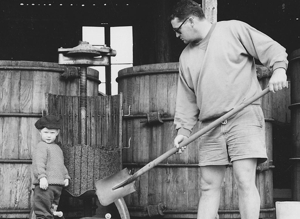
Powell & Son believe that great wine is one that speaks of the place it was grown. Dash of Red believes that a great website is one that speaks of the place it represents. It was clear from the beginning what kind of website Powell & Son would need.
Their wine is about traditional techniques that showcase the quality of the fruit; it’s about power, finesse and elegance; most of all it’s about the family, their story and the dedication to hands-on, minimalist winemaking. These are the qualities we set about reflecting in their website.
We opted to replace their WIX website with a responsive WordPress site that was built almost exclusively for mobile users. We wanted to distinguish Powell & Son and create a remarkable customer experience based on their approach to winemaking. We started with the choice of traditional typography and used that to complement the deliberately pared-back design to create a site worthy of showcasing a premium product.
As with any new venture, or the evolution of an existing one, organic traffic and site availability was paramount so we incorporated a global content delivery network and on-page SEO optimisation. Working to assist in the growth of the business we implemented a digital strategy for database acquisition and marketing automation. Part of this tactic was the introduction of a WooCommerce e-commerce page with optimised product display, related products and comments section for increased lead conversion.
The result of this project is Powell & Son are the proud owners of a mobile-friendly site with enhanced customer conversion capabilities that complements the quality of their product.